Please note that this post contains affiliate links to find out more information, read my disclosure policy for more information.
Minimalism is popular right now, and so are minimalistic spreads for your bullet journal! Without using much colors and decor, and using a black pen and a couple lines can easily create any of the minimalistic bujo spreads below. Minimalistic spreads fulfills the purpose of a weekly spread, cover spread, or a habit tracker with the minimal amount of decor needed.
I love the idea of minimalistic spreads, as they look just as beautiful compared to the colorful bujo spreads with plenty of decor. The simple layout are clean and direct and it get’s the job and idea done.
People often think they would have to decorate their bujo spreads just as fancy as we see on Instagram and such. But minimalistic spreads are just as great of an option and it’s definitely your thing if you would just rather get things done, instead of having to decorate your bujo spreads.
If you’re planning to start a bullet journal, things such as this cheap bullet journal, this Micron Pen Set, and some highlighters to give an extra pop of color! Bullet journaling doesn’t require an expensive notebook with a bunch of colorful pens, you really only need the journal and pens. Though the highlighters will definitely help with the colors XD
Let’s get started on these 23 best minimalistic spreads you need to try :
Source : @lyrajournals
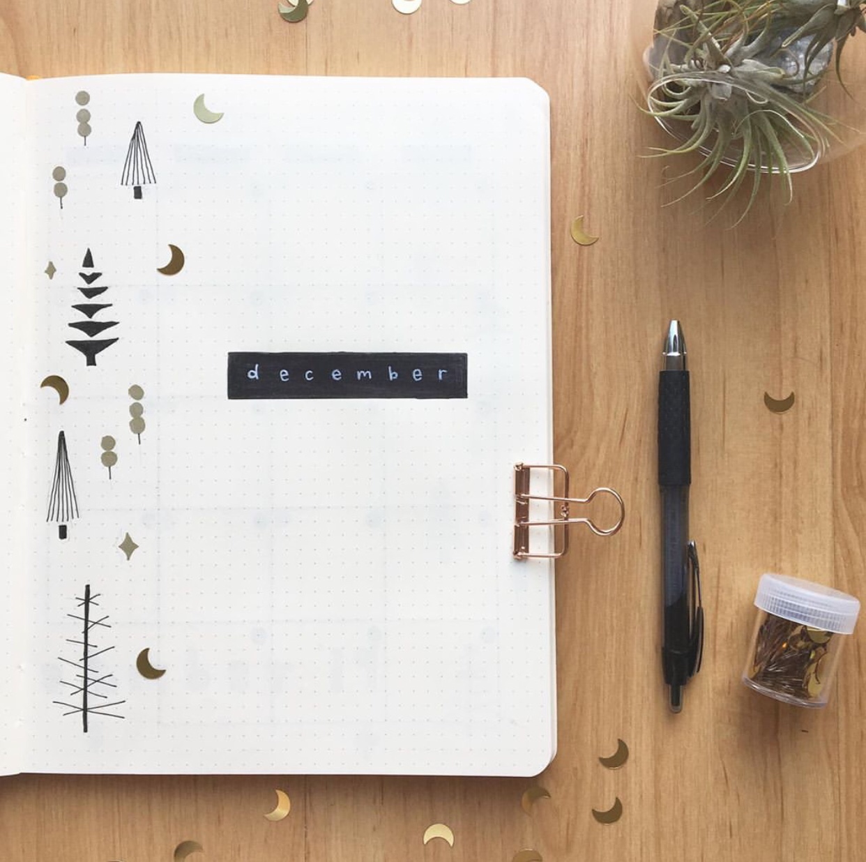
Some simple tree doodles at the side paired with gold moon glitters to match! With a black bar, and December written in white on it. Another idea to make it even simpler, lining a thick washi tape at the side could also be a good idea XD
Source : @flyingpaperwords
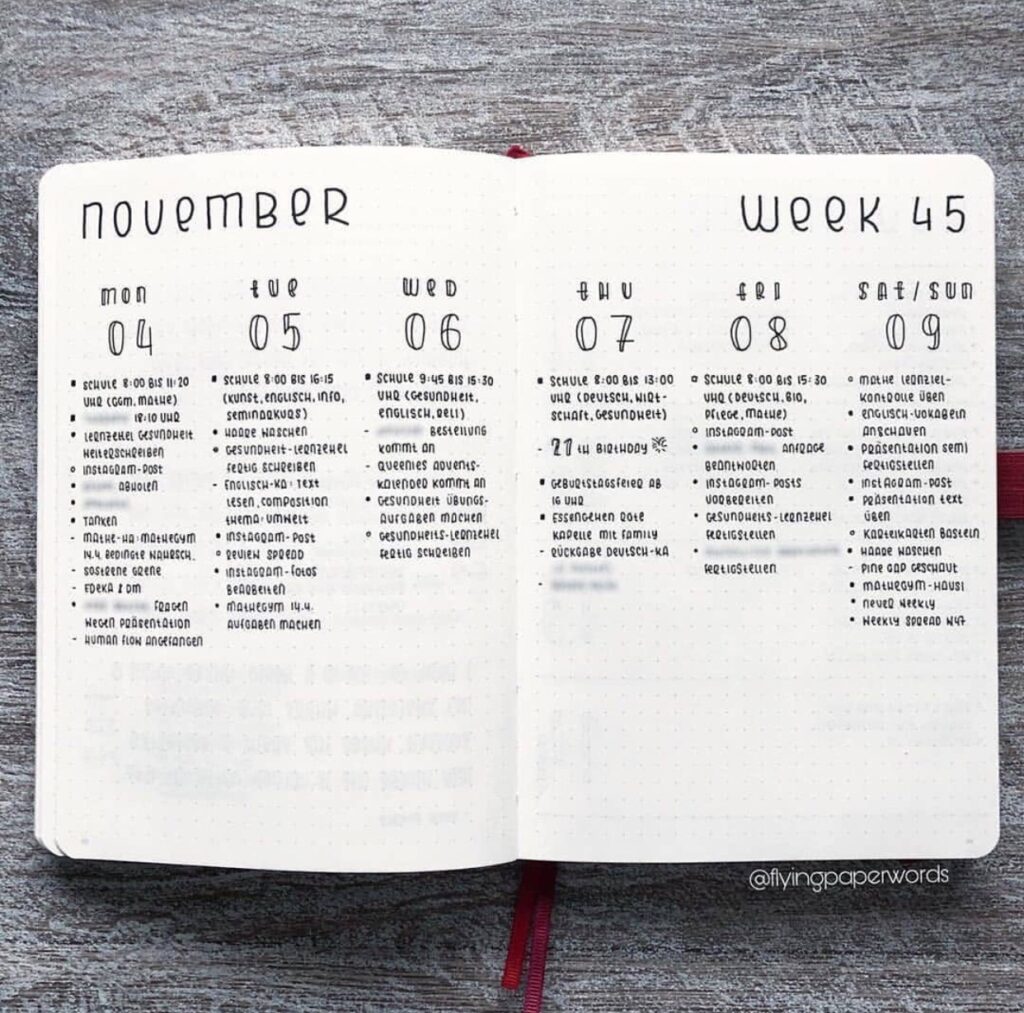
A minimalistic weekly spread that I absolutely adore! I love the font written on the top for November and I liked that the number of weeks was added to the spread.
Source : Pinterest
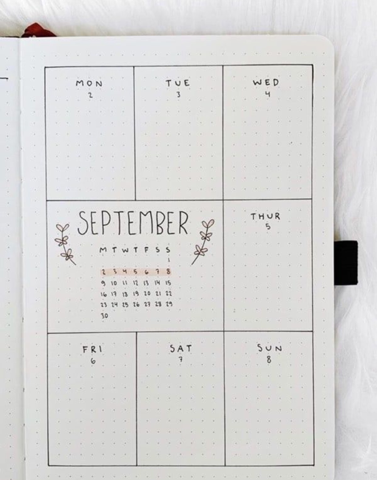
With only a couple lines and boxes, and you got yourself a weekly spread within a page! The extra calendar in the middle is so creative as well, this is so easy to replicate as well XD
Source : @supermassiveblackink
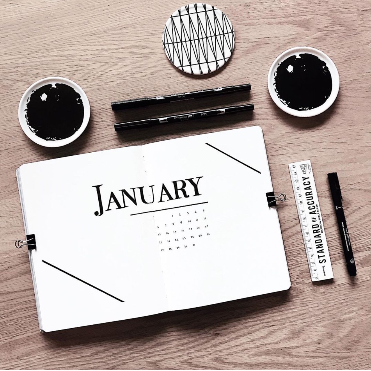
A monthly cover spread by supermassiveblackink with a typewriter looking font of January. And a tiny calendar at the bottom, with two lines as the frames. I love the layout and the simpleness of this, despite probably being unable to write down the beautiful font XD
Source : @ajournalbyannie
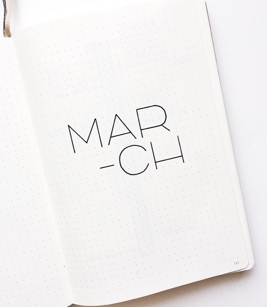
This fits any criteria of a minimalistic spread, this monthly cover spread of March only has the text as the cover. But it’s still beautiful despite it’s simple layout, and in the end, it get’s the job done perfectly.
Remember to pin these and follow me on Pinterest for more XD
Source : @bujomitch
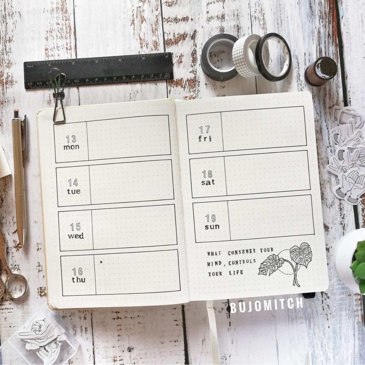
A weekly spread with boxes for each day’s agenda or assignments, I also love the addition of a quote on the bottom with the leaf doodle. If I’m not wrong, the words are printed from stamps, so that might be a good investment in the future XD
Related : 24 Adorable Sleep Trackers for Your Bullet Journal
Source : Pinterest
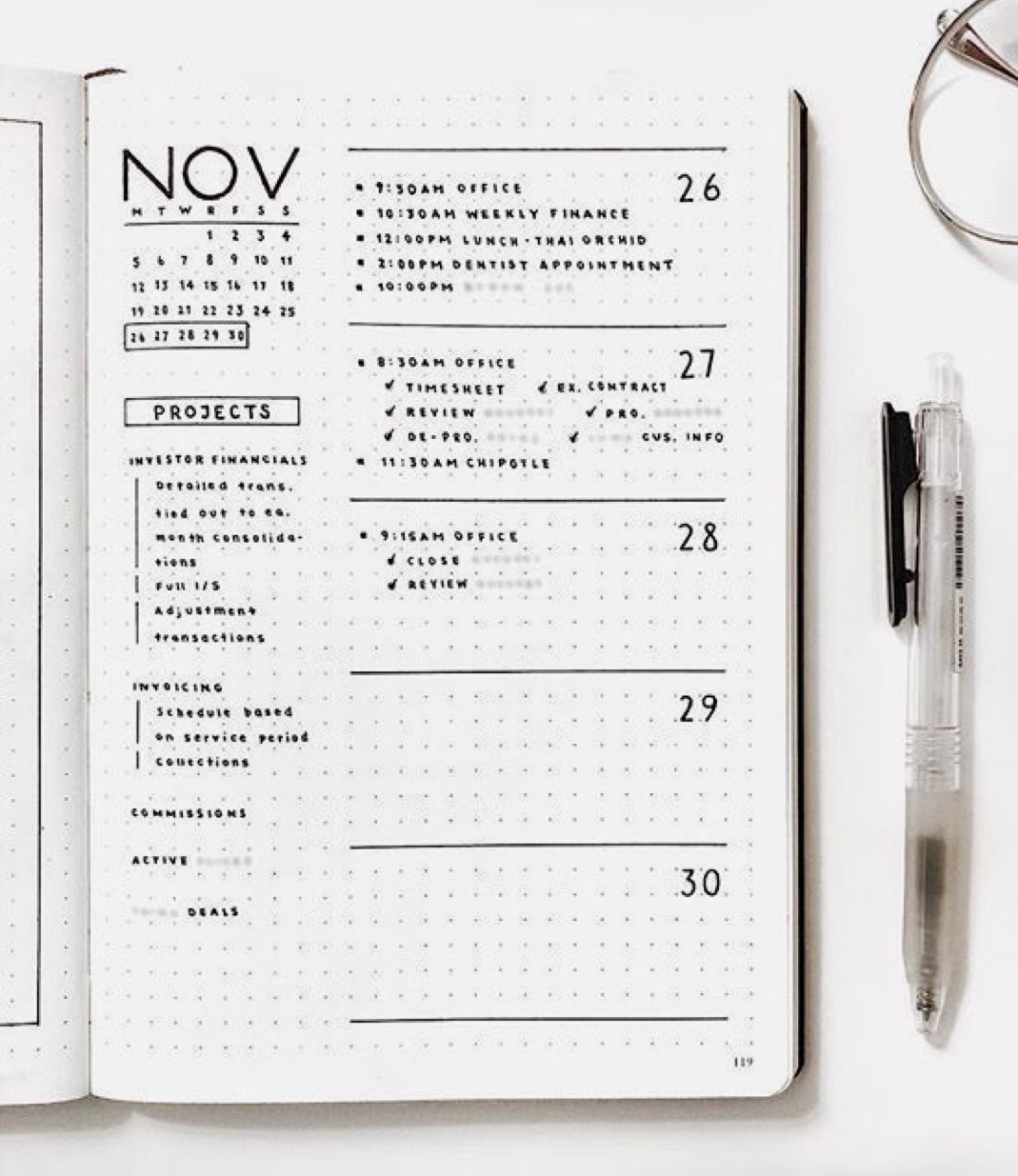
Another weekly spread, separated by lines in between, with bullet points listed down for each day. I love this person’s handwriting as well, it’s small and neat, which I don’t have :P, but the projects bar at the left is something I should start doing as well XD
Source : @ashtyn_plans
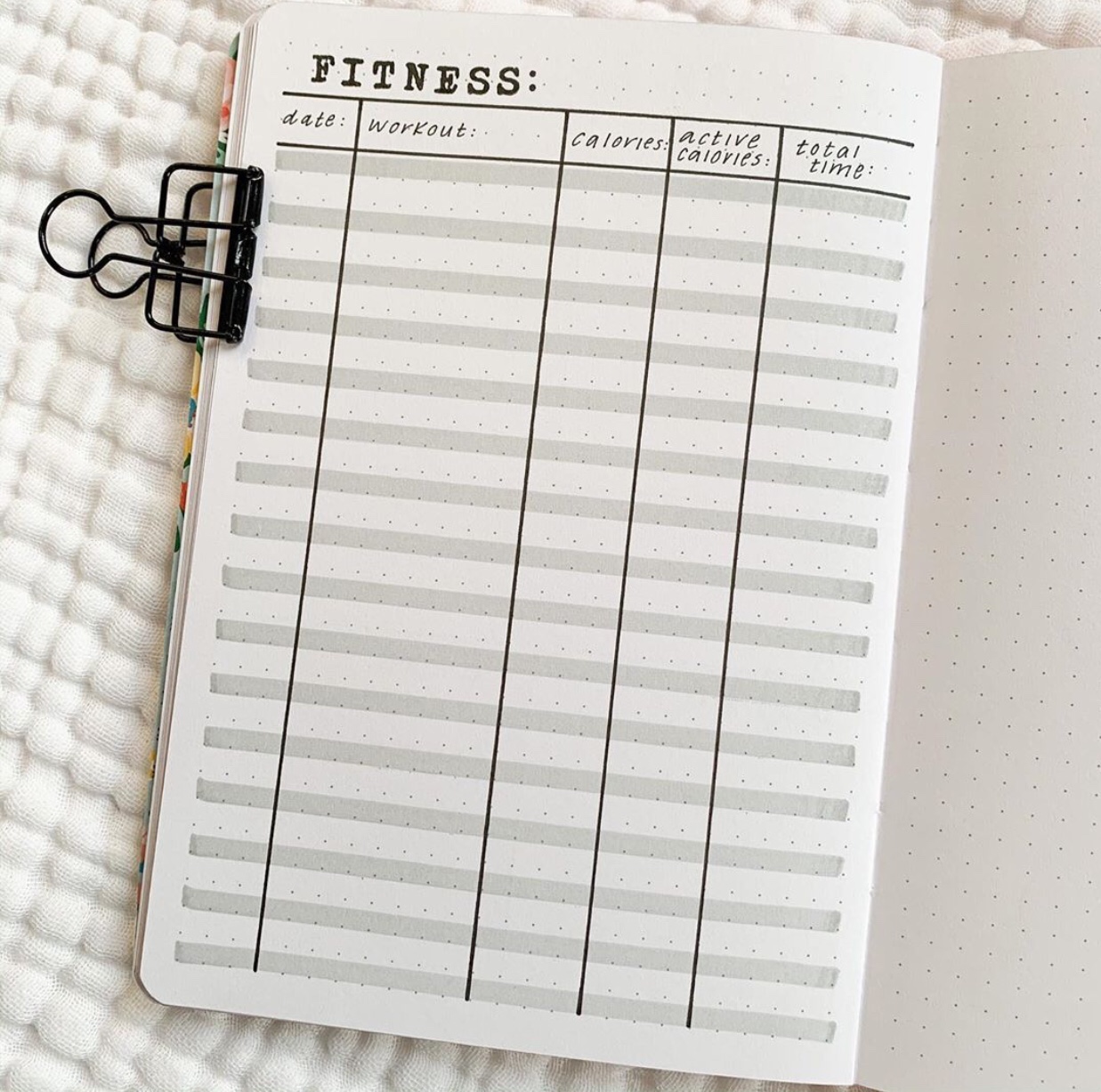
I added a minimalistic fitness tracker for anyone who’s on their own fitness journey or you could change this to any sort of tracker in a list format like this one. Ideas could be a movie tracker, book lists, things to buy, expense tracker etc.
Source : @lifeonthedot
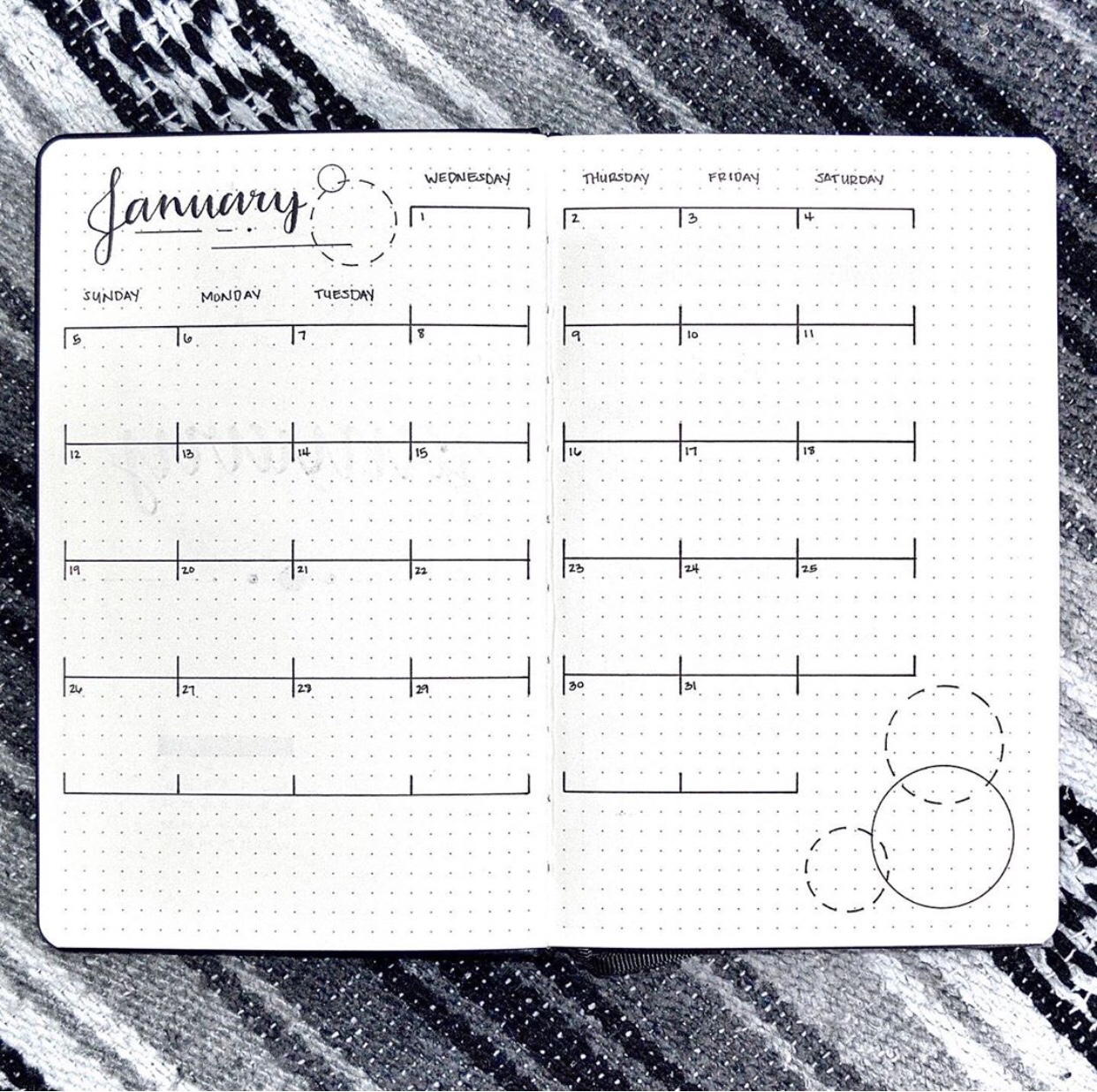
A monthly calendar for January, with simple black lines labeling between each day, and dotted circles with different segmented lines to add more dimensions to the overall spread.
Comment below your favorite bullet journal artist~

Source : @supermassiveblackink
Once again, this font is beautiful, and if I could write like that, I would. A monthly cover spread with just the month written down, if this isn’t minimalistic, I don’t know what is.
Source : Pinterest
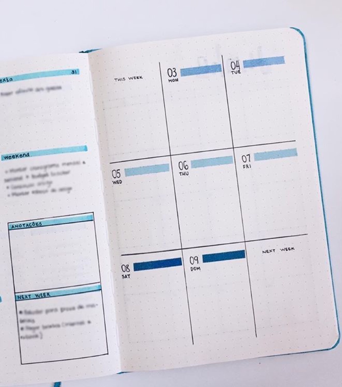
Boxed weekly spread with different shades of blue highlighted next to each date. And two extra boxes for what I’m guessing things to get done this week and next week? Nonetheless, I love the extra highlighted lines, and it being my favorite color helped XD
Source : @geoffstudy
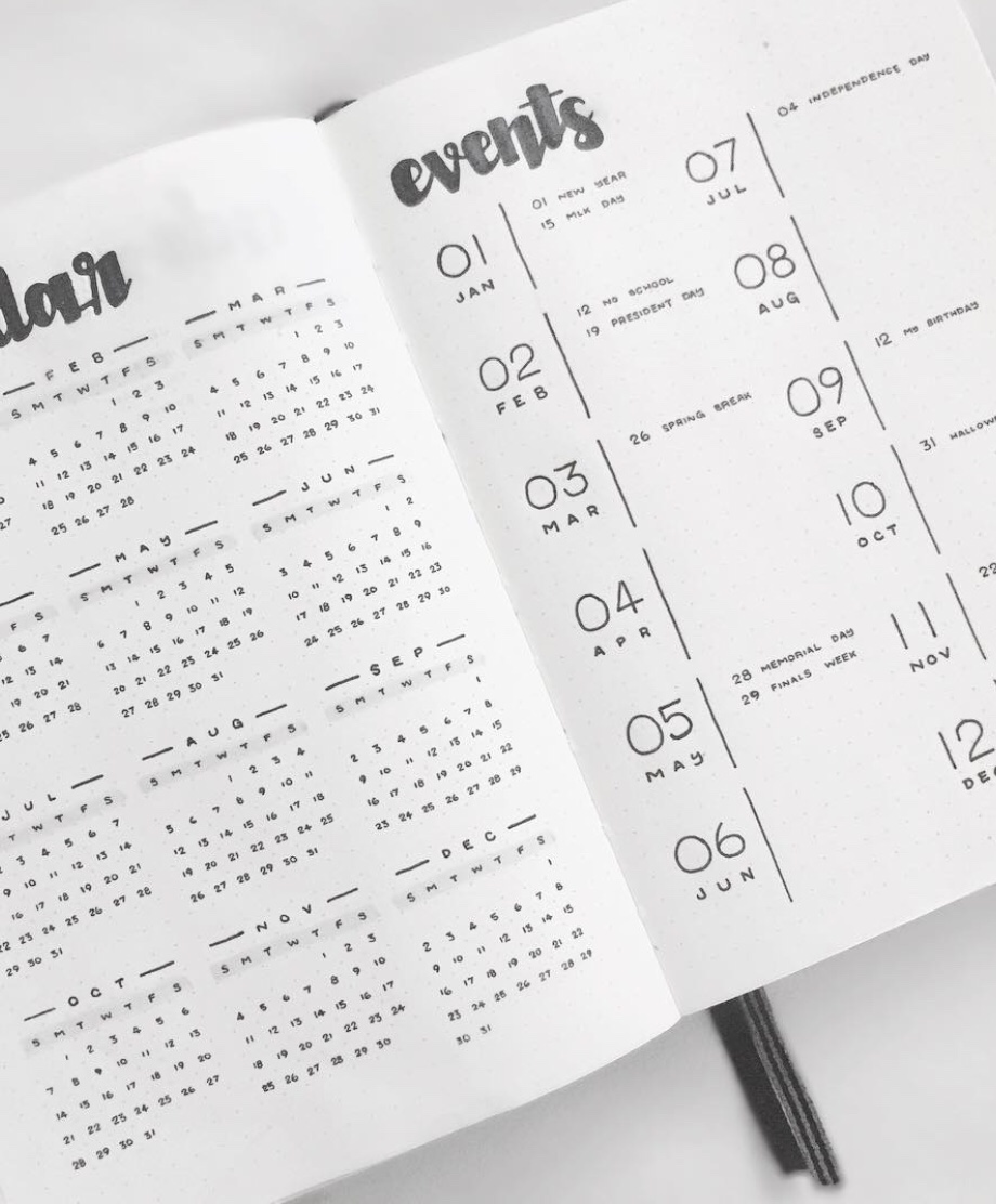
A weekly spread mixed with a calendar at the side, I’m pretty sure I’ve convinced you now that the spreads made with just a black pen can be equally beautiful as a colorful spread XD
Source : @bujojane
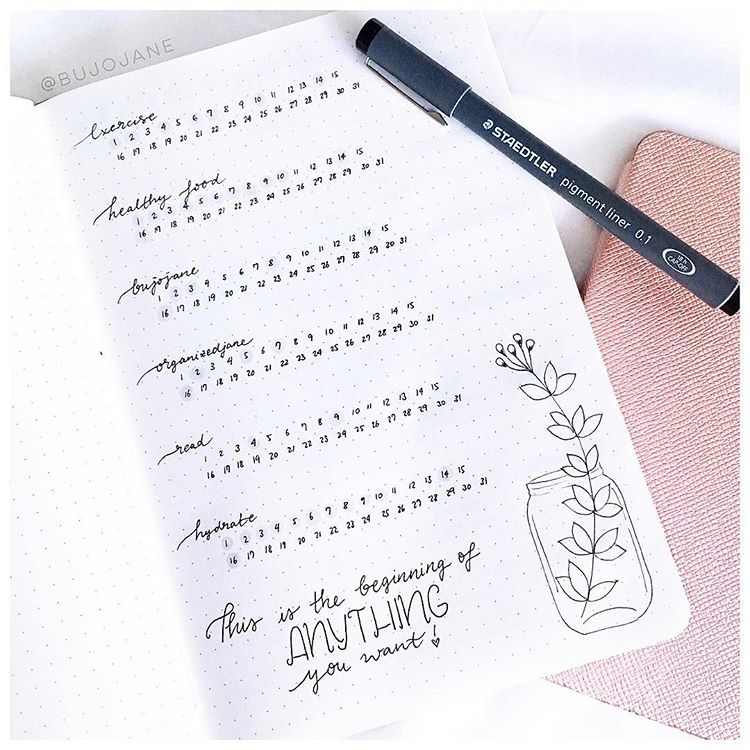
A habit tracker with a simple layout, though I love the cursive looking font for the habit she’s tracking down. The extra quote of “This is the beginning of ANYTHING you want!” is incredibly fitting for such a tracker as well.
Source : @lifeisarty
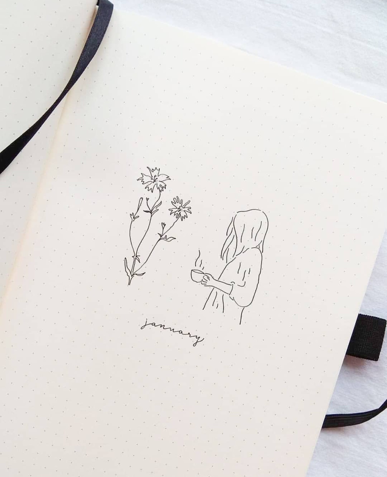
A January cover spread, with flowers and a girl holding a cup, it’s so intricate, despite only consisting of several lines. The tiny written word for January is also so cute :3
Source : Pinterest
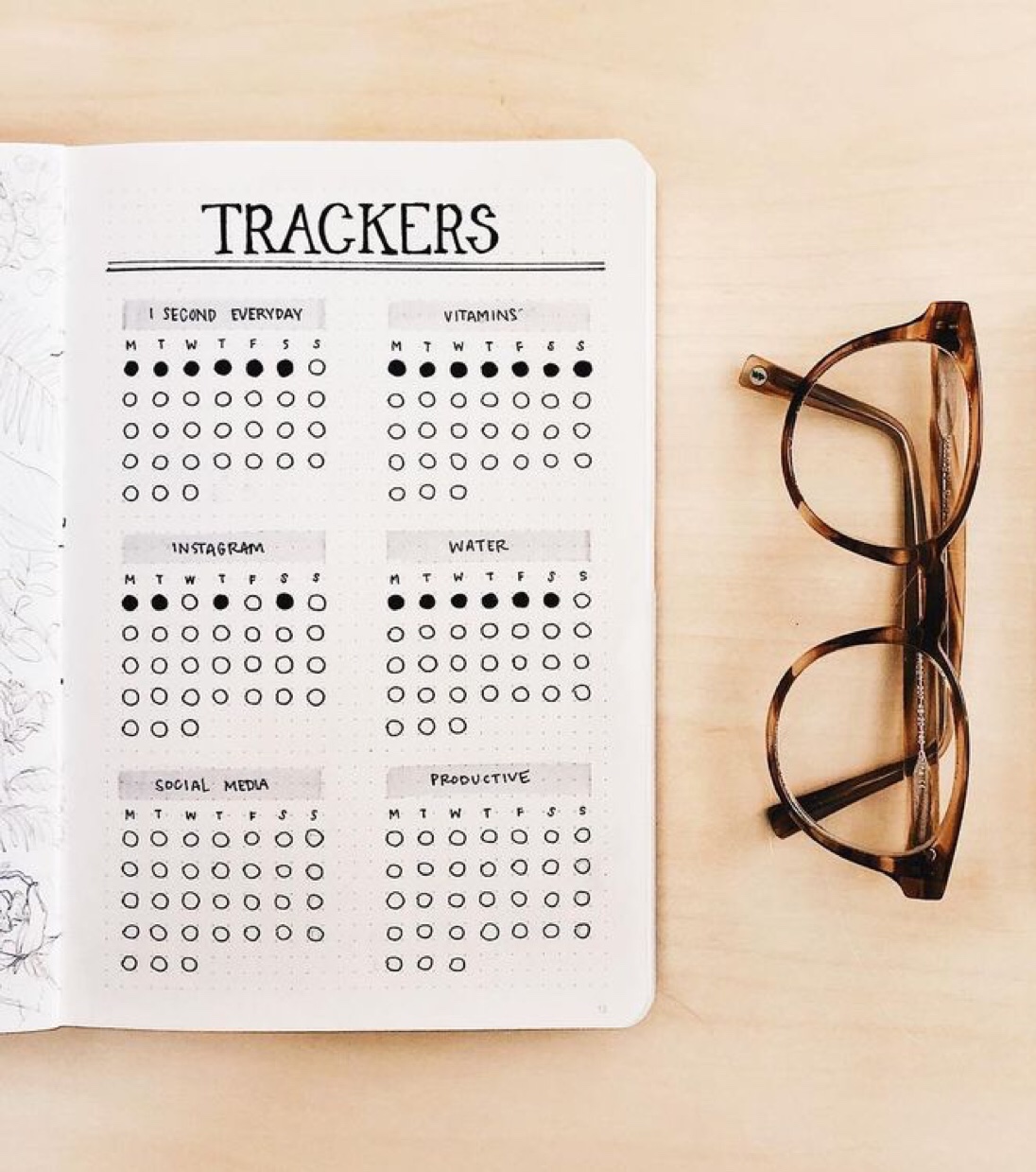
Another habit tracker for your minimalistic bullet journal, with dots and the title written over a gray highlighter. This isn’t as minimalistic as other spreads, but it was really pretty to me XD
Source : @marthasjournal
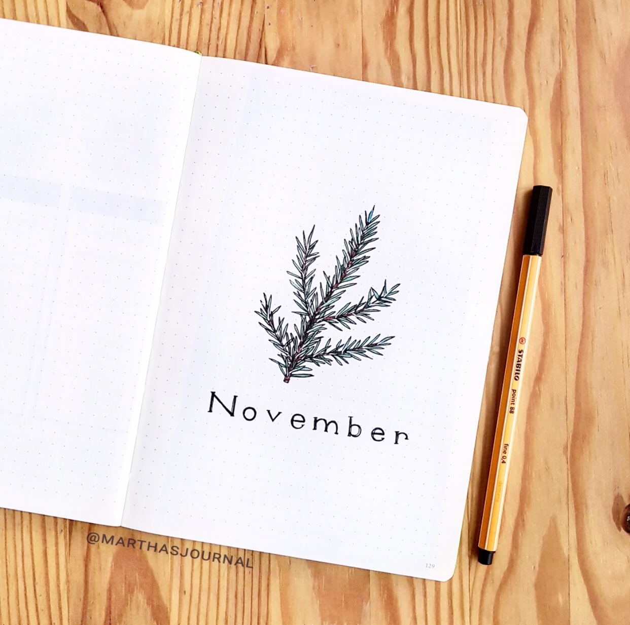
I love the spaced out font for the word November, and the small leaf, or fern? Drawn out on the top, though I’m not sure how realistic my drawing would look compared to this one XD
Pin your favorite one~
Source : @journal.it
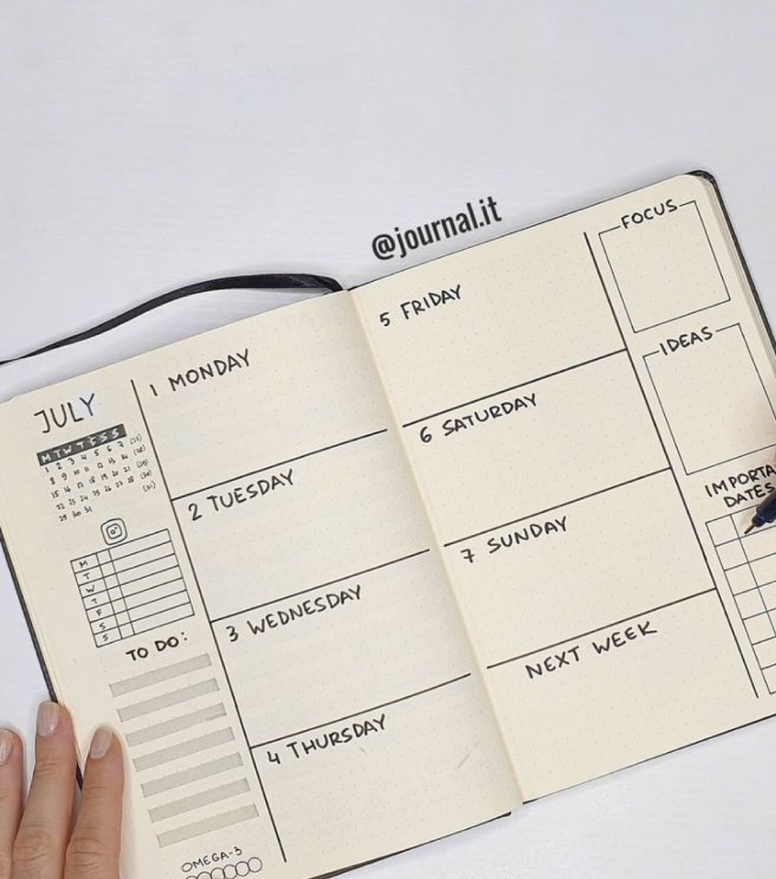
This could be one of my personal favorite bujo weekly spread, as it has practically everything I could ask for in a spread. A mini calendar, a to-do section, focus points, ideas, important dates, and a next week section? I mean, what more can you ask for?
Source : @pacificnotation
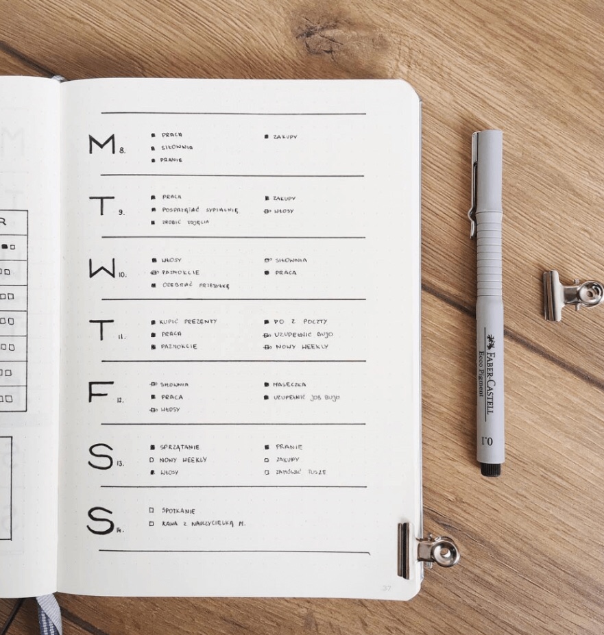
A weekly spread with a to do list format for each thing on the agenda, this is another prime example of minimalistic bujo spread at its finest XD And I love the simple layout of this, as it uses every extra space in the page.
Source : @ajournalbyannie
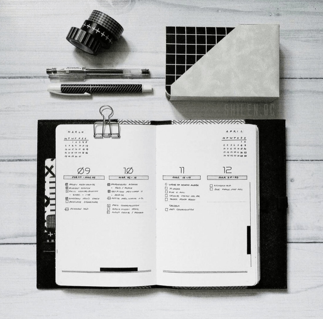
A well sectioned off weekly spread, though my heart cries out for the big empty space on the bottom. Extending it down from the top down to thirteen and so on could’ve been a good idea as well.
Source : @artwwwera
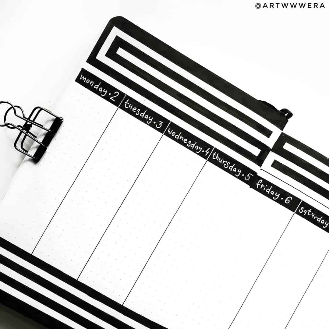
Simple thick black lines, with almost a hypnotizing look to it. With a spacious long bar left for each day of the week’s agenda or to – do lists. Maybe instead of the thick lines on top, a notes section can be added in there as well.
Source : @bullet_journalish
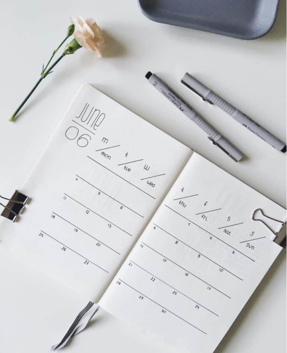
A minimalistic bujo calendar spread with just some lines and numbers, along with words. This could easily be replicated by even the worst of handwritings, since a ruler can get the job done instantly.
Source : @abulletandsomelines
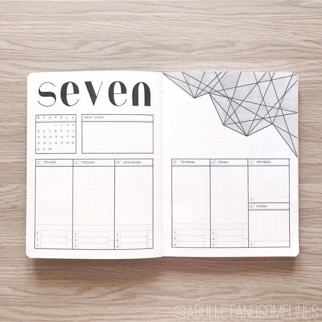
Another weekly spread, with lines that form different shapes and dimensions with the thinner lines on the inside. I love the details inside the boxes with numbered lists and a next week note tab next to the calendar.
Source : @bulletbyjulia
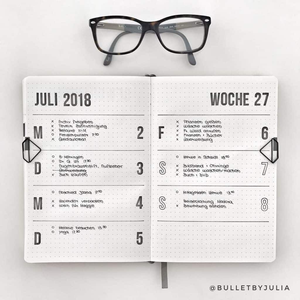
A weekly spread that’s incredibly pleasing to the eye with it’s simple layout, and another reason for you to try out some stamps if you like this spread :3 I love big space given between each day for you to write down your things to do for each day.
Conclusion :
And that’s all I got for the 23 best minimalistic spreads you need to try! Comment below your favorite one, share this post if you liked it, and pin some of the pictures!
2 comments